Notes 03: Plotting Data
Reading: Gilat Ch. 5
Code from class: plotting.m
Here is an example from
MathWork's
MATLAB documentaiton
x = 0:pi/100:2*pi;
y = sin(x);
plot(x,y);
% Now label the axes and add a title. The characters \pi create the
% symbol π. See "text strings" in the MATLAB Reference documentation for
% more symbols:
xlabel('x = 0:2\pi');
ylabel('Sine of x');
title('Plot of the Sine Function','FontSize',12);

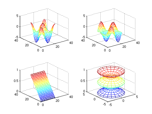
Here's another example from that tutorial.
t = 0:pi/10:2*pi;
[X,Y,Z] = cylinder(4*cos(t));
subplot(2,2,1); mesh(X)
subplot(2,2,2); mesh(Y)
subplot(2,2,3); mesh(Z)
subplot(2,2,4); mesh(X,Y,Z)
-
You may do this manually through MATLAB's GUI by going to the
File menu of the Figure window and selecting
Save. By default, it will use a MATLAB Figure file format
with suffix .fig that is convenient for reloading in
MATLAB. You may also change the file type to export to more
standard figure formats (e.g., .jpg, .eps,
.pdf, .png).
-
You can also perform the save from the MATLAB command window by
using a command such as saveas('myPicture.jpg') or
saveas(gcf,'myPicture.pdf'). The variable gcf
is a handle designating the current figure (some scripts may
open multiple figure windows at once, in which case the first
parameter can be used to select from among those figures).
-
plot(y)
for vector y, makes a line
graph using the vector values as y-coordinates. The
corresponding x-coordinates are implicitly 1:length(y).
plot(1 ./ 2 .^ (1:10));
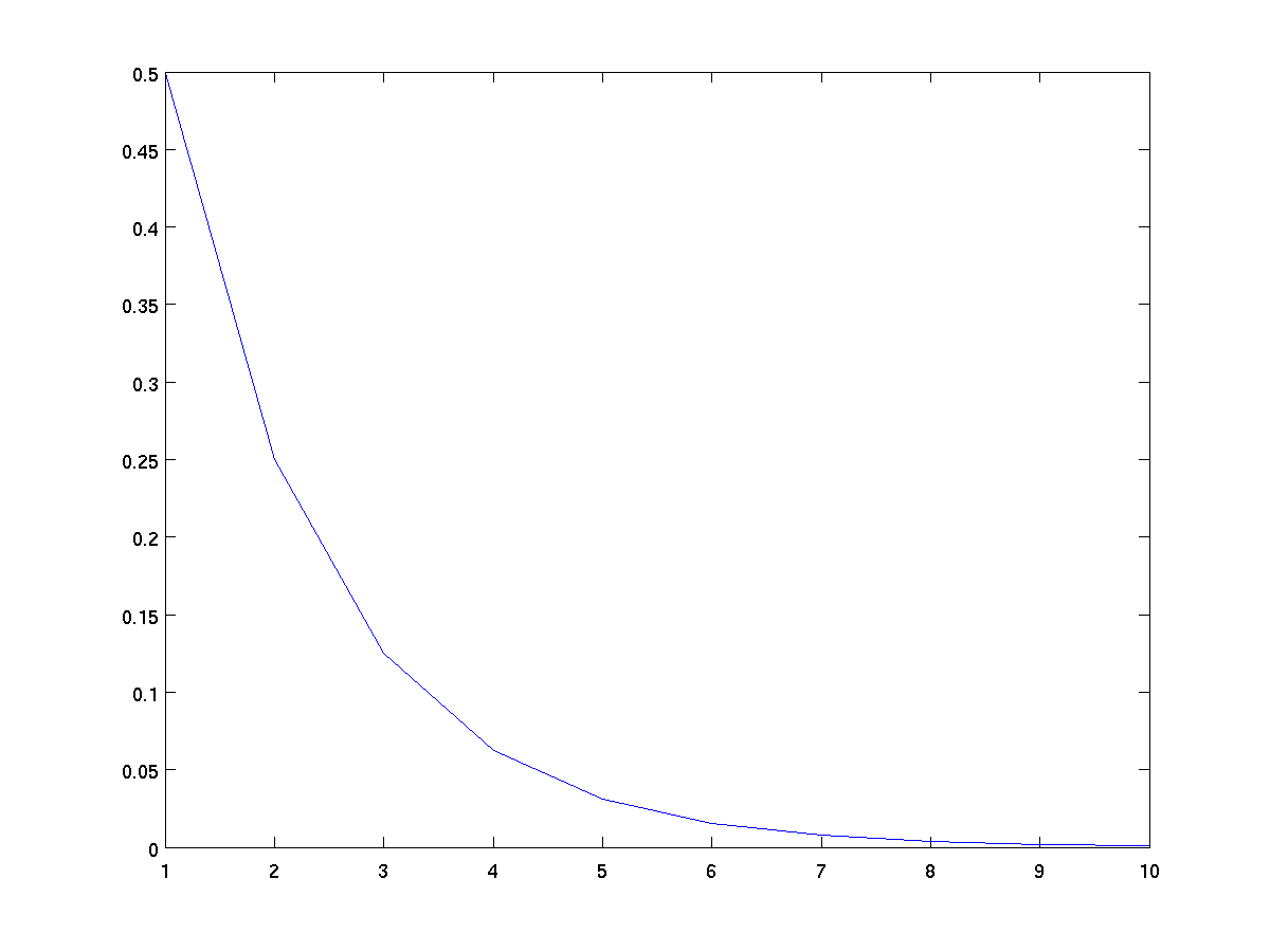
This plot connects the points (1, 1/2), (2, 1/4), (3, 1/8), ..., (10, 1/1024)
-
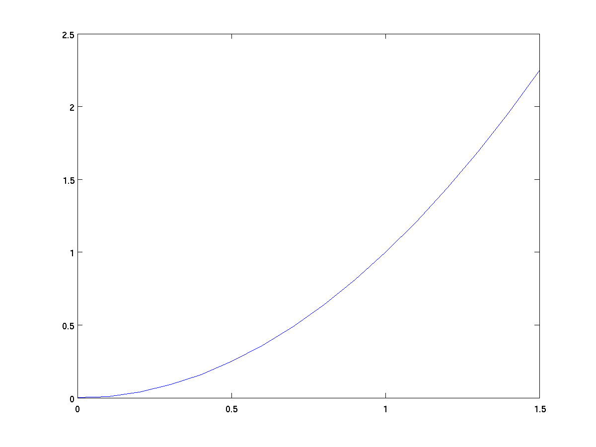
plot(x, y)
for vectors x and y with equal length, makes
a line graph connecting the corresponding x-y points.
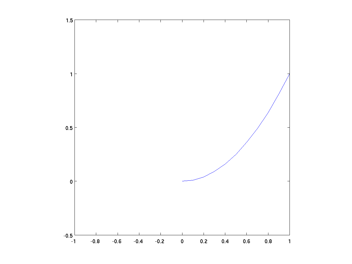
      x = 0:0.1:1.5;       % steps from 0 to 1.5, at 0.1 intervals
      y = x .^ 2;          % y = x^2 parabola
      plot(x,y);
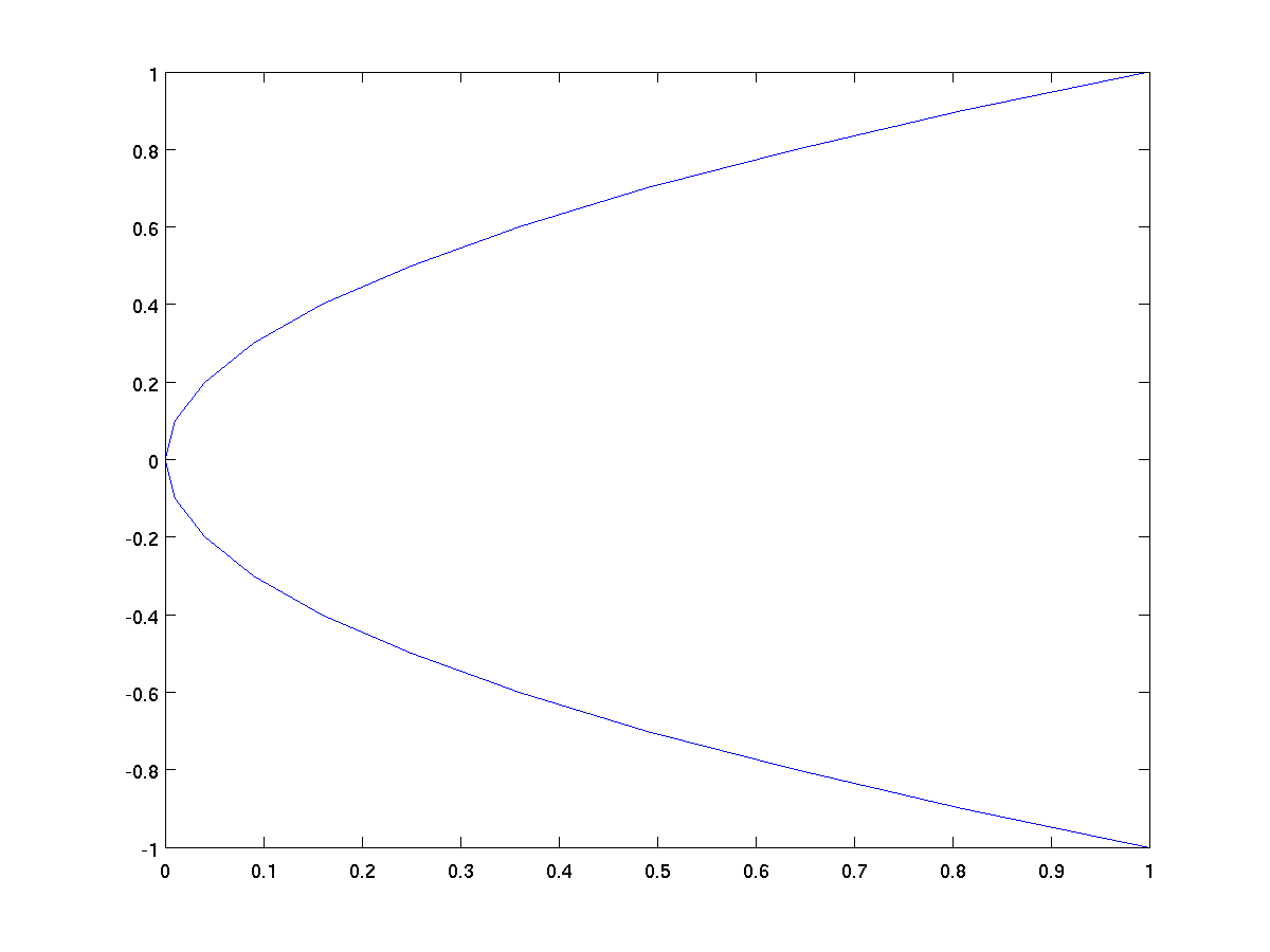
We can plot any pairs of vectors this way so long as they have
the same length. It is not necessary for x to be a simple
range. For example, we could plot x as a function of y as.
      y = -1:0.1:1;
      x = y .^ 2;          % x = y^2 horizontal parabola
      plot(x,y);
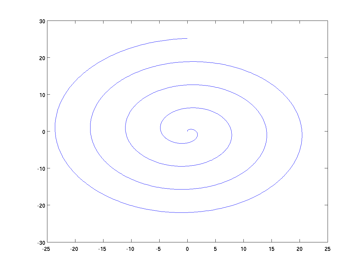
Here is a classic parametric curve, where both x and y are
defined relative to another parameter t.
      t = 0:pi/200:8*pi;
      x = t .* sin(t);
      y = t .* cos(t);
      plot(x,y);
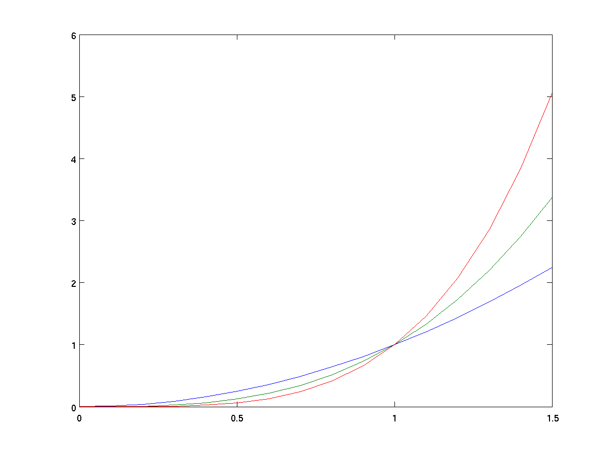
If x is a vector and y is a matrix,
plot(x,y) will simultaneously plot individual rows (or columns) of y.
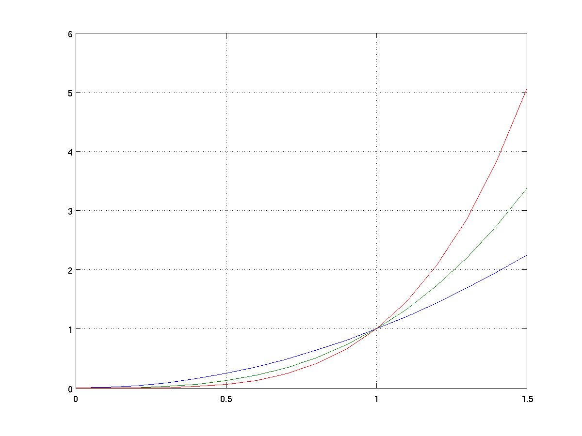
      x = 0:0.1:1.5;                     % steps from 0 to 1.5, at 0.1 intervals
      y = [x .^ 2; x .^ 3; x .^ 4];      % three functions in one
      plot(x,y);
A similar style can be used with x as a matrix and
y as a vector, in which case all rows (or columns) of
x will be plotted against the vector y.
By default, MATLAB automatically scales both axes to make good use of
the figure window while ensure not to clip any of the plotted
data. For example, in our earlier graph of the
equation y = x .^ 2, the x-axis goes from
0 to 1.5 because that was the range of values in our vector 0:0.1:1.5
while the y-axis ranges from 0 to 2.5. Yet in the graph where we
simultaneously graphed x^2, x^3, and x^4,
the y-range was scaled from 0 to 6 so that all three plots fit.
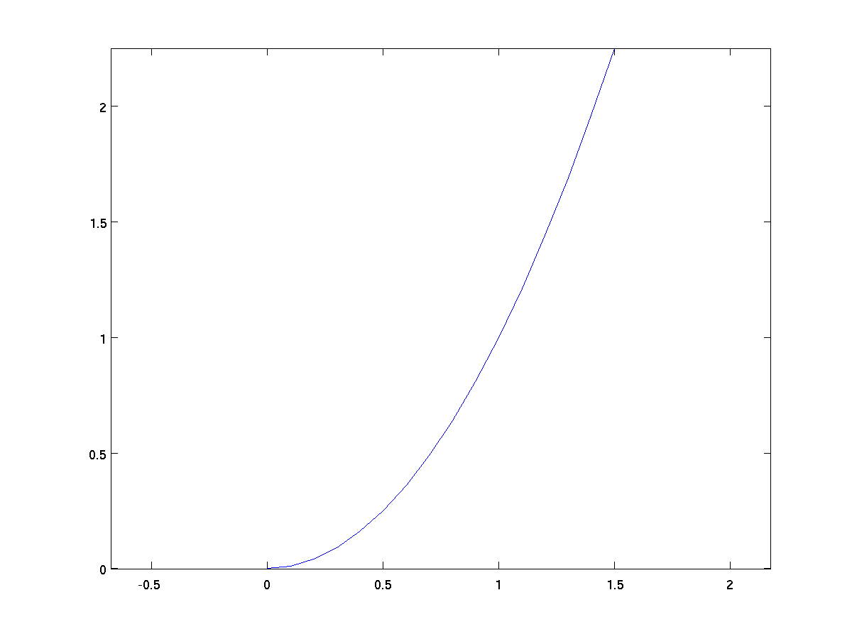
While auto-mode for axes is usually convenient, there are times when
we would like to better control the choice. For example, in the graph
of x^2, the scale for the x-axis is not the same as the scale
for the y-axis. This distorts certain aspects of the graph, for
example if trying to estimate the slope of the curve when x=1.
We can force the two axes to be drawn with equal scale by using the
command axis equal after the initial plot.
x = 0:0.1:1.5;       % steps from 0 to 1.5, at 0.1 intervals
y = x .^ 2;          % y = x^2 parabola
plot(x,y);
axis equal;
We can also set the axes range manually, using a syntax of the form
axes([xmin xmax ymin ymax]).
x = 0:0.1:1.5;       % steps from 0 to 1.5, at 0.1 intervals
y = x .^ 2;          % y = x^2 parabola
plot(x,y);
axis([-1 1 -0.5 1.5]);
A separately controllable aspect of the figure is whether grid lines
are drawn across the primary pane of the graph. By default, the grid
lines are not there, but they can be turned on by giving the command
grid on, as in the following.
x = 0:0.1:1.5;                     % steps from 0 to 1.5, at 0.1 intervals
y = [x .^ 2; x .^ 3; x .^ 4];      % three functions in one
plot(x,y);
grid on;
It is possible to augment a figure with a variety of labels
-
xlabel('your message goes here')
Places the given string along the x-axis.
-
ylabel('your message goes here')
Places the given string vertically along the y-axis.
-
title('your message goes here')
Places a title above the entire figure.
-
In a case when there are multiple lines on a single graph,
we can add a custom legend to label the lines. Here
is an example.
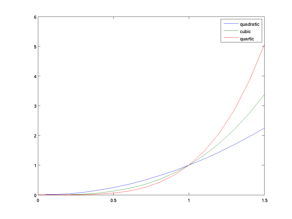
      x = 0:0.1:1.5;                     % steps from 0 to 1.5, at 0.1 intervals
      y = [x .^ 2; x .^ 3; x .^ 4];      % three functions in one
      plot(x,y);
      legend('quadratic', 'cubic', 'quartic');
It is also possible to control the placement of a legend, for
instance repositioning it to the top-left corner with the command
legend('quadratic', 'cubic', 'quartic', 'Location', 'NorthWest');
We have seen that by default, a graph uses a solid blue line as the
primary line style. The line style can be changed by providing what
is known as a line specifier as extra arguments to a plot call. The
line specifier can be used to control three aspects:
-
The color (using one character code for eight common colors)
-
The line style (e.g. - for solid line, -- for
dashed line, : for dotted line).
-
A "marker" to draw on the actual data points (e.g. o
for a circle).
Please see
MATLAB
documentation for more details.
Here is an example.
plot(1 ./ 2 .^ (1:10), 'k*:');     % blac(k), asterisk markers, dotted lines
title('Inverse powers of two');
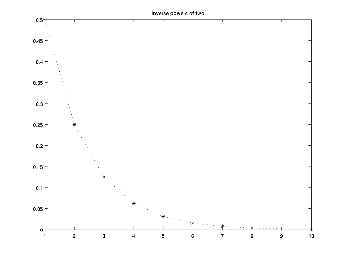
Note that if you use a line specifier and provide a marker type but
not a line type, then the markers will be drawn without the connecting lines.
Typically, each call to plot causes a new figure to be
drawn. However, there are several techniques to combine multiple
graphs in a single figure.
-
We already showed how plot(x,y) can be used to plot
vector x against all rows of a matrix y. It is also possible to
combine completely indpendent plots in a single call using a
format like plot(xA, yA, xB, yB). This plots
xA versus yA, and xB versus
yB. It requires that the length of xA and
yA match each other, but not necessarily matching the
lengths of xB and yB.
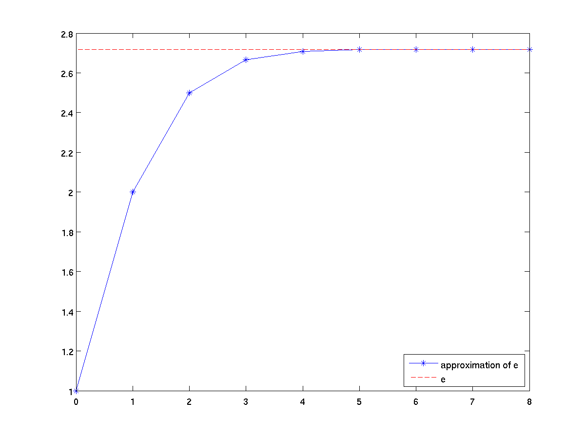
      terms = 0:8;
      approxE = cumsum(1 ./ factorial(terms));
      plot(terms approxE, '*-', [terms(1) terms(end)], [exp(1) exp(1)], 'r--');
      legend('approximation of e', 'e', 'Location', 'SouthEast');
-
The command hold on tells MATLAB that all further
plots should be put on the current figure rather than a new
figure. This mode can be turned off by a subsequent
hold off command. Here is a way to write the
preceding example with two separate calls to plot.
      terms = 0:8;
      approxE = cumsum(1 ./ factorial(terms));
      plot(terms approxE, '*-');
      hold on;
      plot([terms(1) terms(end)], [exp(1) exp(1)], 'r--');
      legend('approximation of e', 'e', 'Location', 'SouthEast');
-
Instead of overlaying several plots on the same set of axes, a
figure window can be subdivided into separate panels of equal
size. This is done by prefacing a normal drawing command
with the command subplot(r, c, n),
where r designates the number of rows in the division,
c the number of panels in the division, and n the
cardinality of the current subplot on that grid (numbered in
row-major order) at which the drawing should be placed.
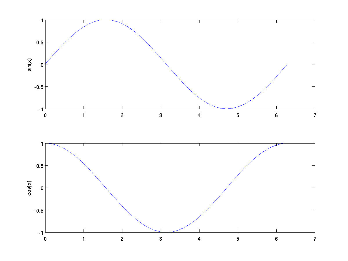
      x = 0:pi/20:2*pi;
      subplot(2,1,1);
      plot(x, sin(x));
      ylabel('sin(x)');
      subplot(2,1,2);
      plot(x, cos(x));
      ylabel('cos(x)');
-
-
-
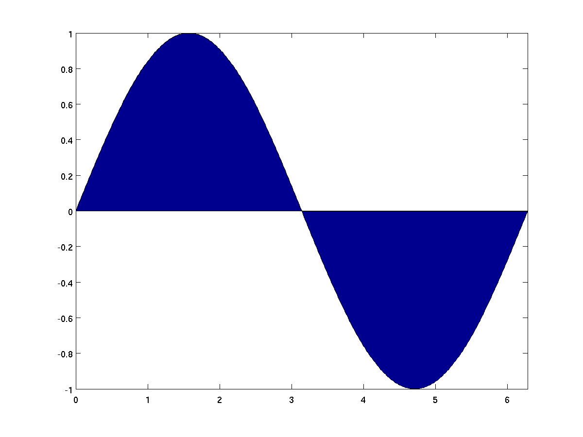
When x and y are vectors, a call to
area(x,y) is similar to plot(x,y), except that
it fills in the area between the x-axis and the curve.
      x = 0:pi/200:2*pi;
      area(x, sin(x));
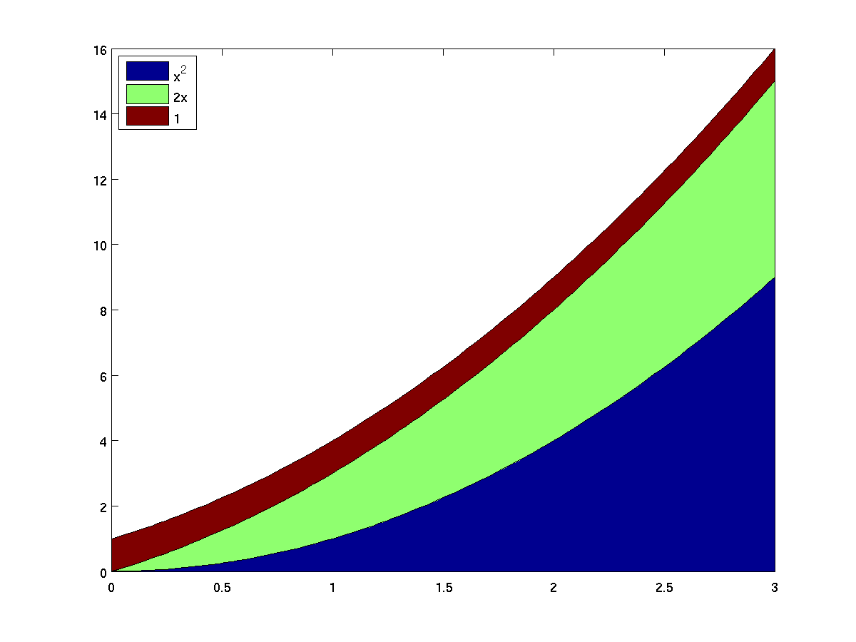
In the case that x is a vector and y is a
matrix that has a number of rows matching the length of
x, the area graph essentially plots the cumulative sums
of the rows of y. As an example, here is a colorful
way to show the graph of the polynomial x^2 + 2x + 1,
with three different colors showing the contribution of the
three terms.
      x = linspace(0,3,100);
      y = [x .^ 2;  2 .* x; ones(1,length(x))]';    % note the transpose
      area(x, y);
      legend('x^2', '2x', '1', 'Location', 'NorthWest');
-
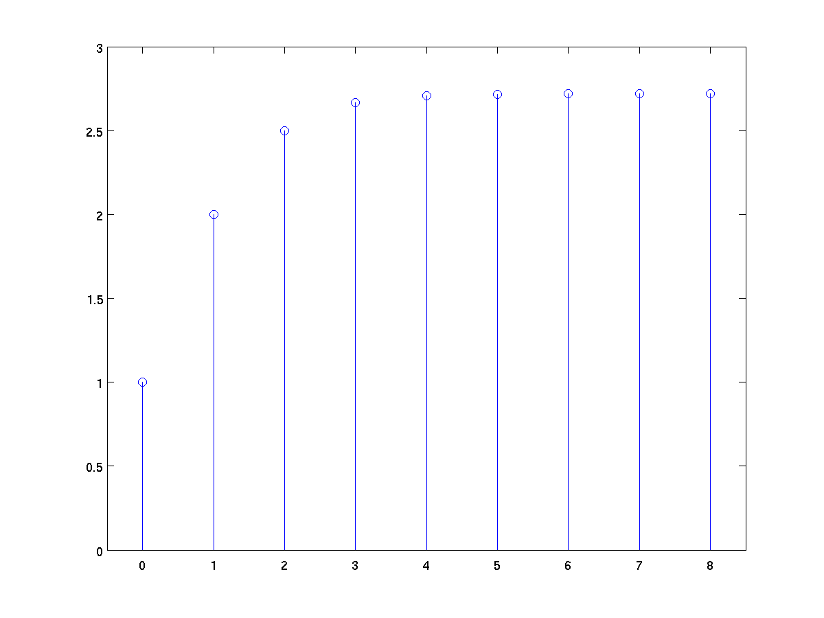
Plots y-values as stems relative to x.
      terms = 0:8;
      approxE = cumsum(1 ./ factorial(terms));
      stem(terms, approxE);
      axis( [ -0.5 8.5 0 3] );   % better padding
-
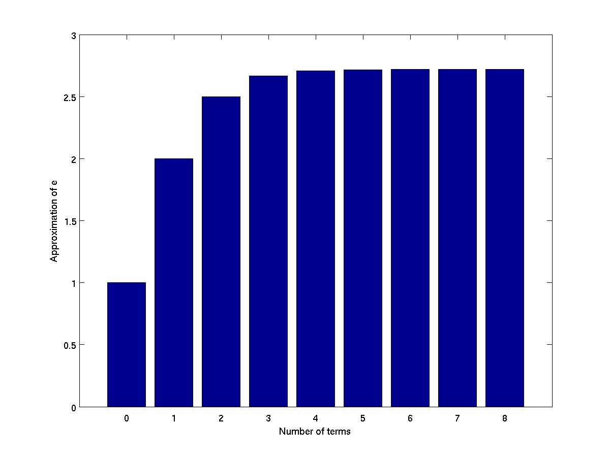
Used to create vertical bar graphs.
      terms = 0:8;
      approxE = cumsum(1 ./ factorial(terms));
      bar(terms, approxE);
      xlabel('Number of terms');
      ylabel('Approximation of e');
-
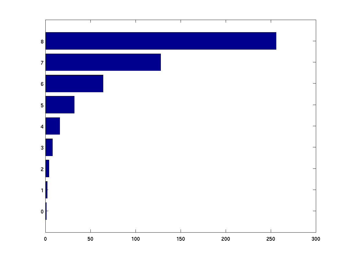
Used to create horizontal bar graphs.
      terms = 0:8;
      powers = 2 .^ terms;
      barh(terms, powers);
-
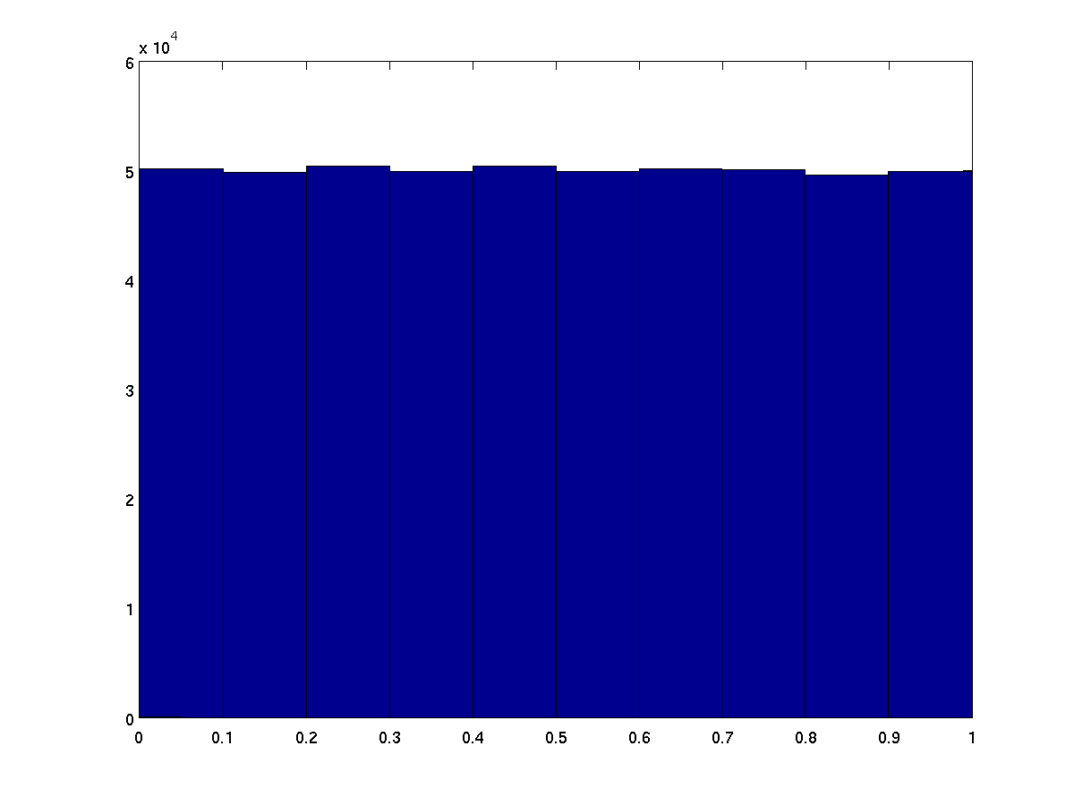
Used to create a vertical bar graph by grouping original data
set into a histogram. By default, 10 buckets are created
ranging from the minimum to maximum observed values. The number
of desired buckets can be specified as the second parameter.
Alternatively, the desired dividing points ("edges") of the
buckets can be specified as a vector.
hist(rand(1,500000)); % 500,000 random values in ten buckets
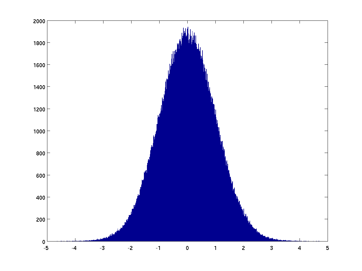
Here's an example with using randn to produce a normal distribution
hist(randn(1,500000),1000); % 500,000 random values in 1000 buckets
Here is an example on a discrete data set, perhaps representing
years in which people were born.
      birthyear = [1987 1990 1988 1991 1984 1990 1989 1987 1988 1990 1988];
      range = min(birthyear):max(birthyear);    % 1984:1991 in this case
      hist(birthyear, range);
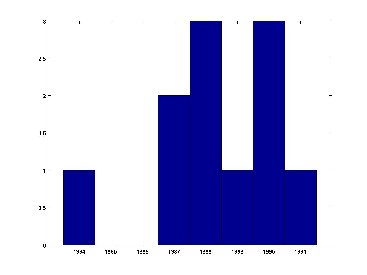
Note about histograms
The hist function is far more general than we have
shown here. Although it produces a figure by default, the
result can instead be stored as a vector. For example,
      birthyear = [1987 1990 1988 1991 1984 1990 1989 1987 1988 1990 1988];
      range = min(birthyear):max(birthyear);    % 1984:1991 in this case
      result = hist(birthyear, range);          % no figure produced
In this case, the variable result is set to the vector
[1 0 0 2 3 1 3 1].
-
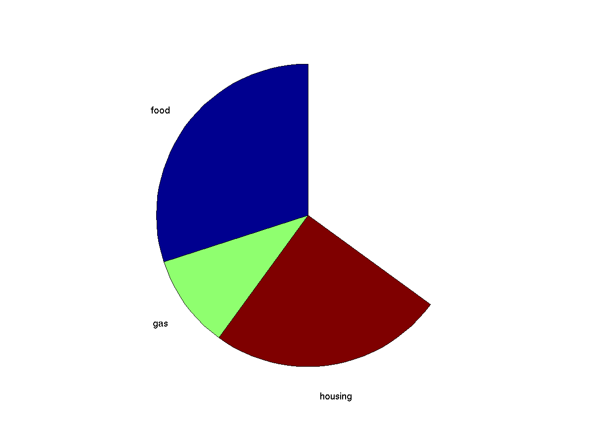
Builds a pie chart from a series of values. Negative values in
the input are ignored. If the cumulative sum of the values is
greater than one, the pie chart is drawn as percentages.
pie( [0.3 0.1 0.25], {'food' 'gas' 'housing'}); % notice labels are enclosed with curly braces not square braces
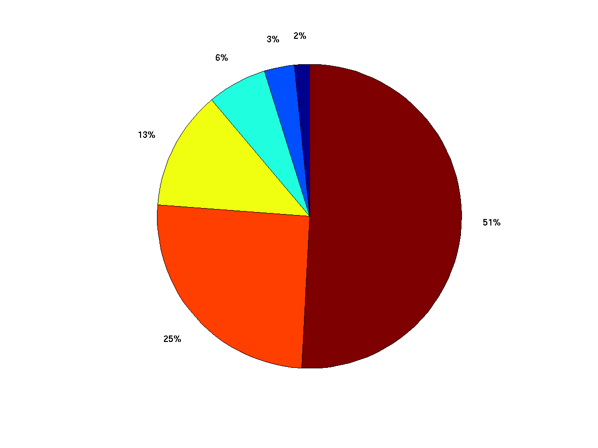
pie (2 .^ (0:6)); # no explicit labels
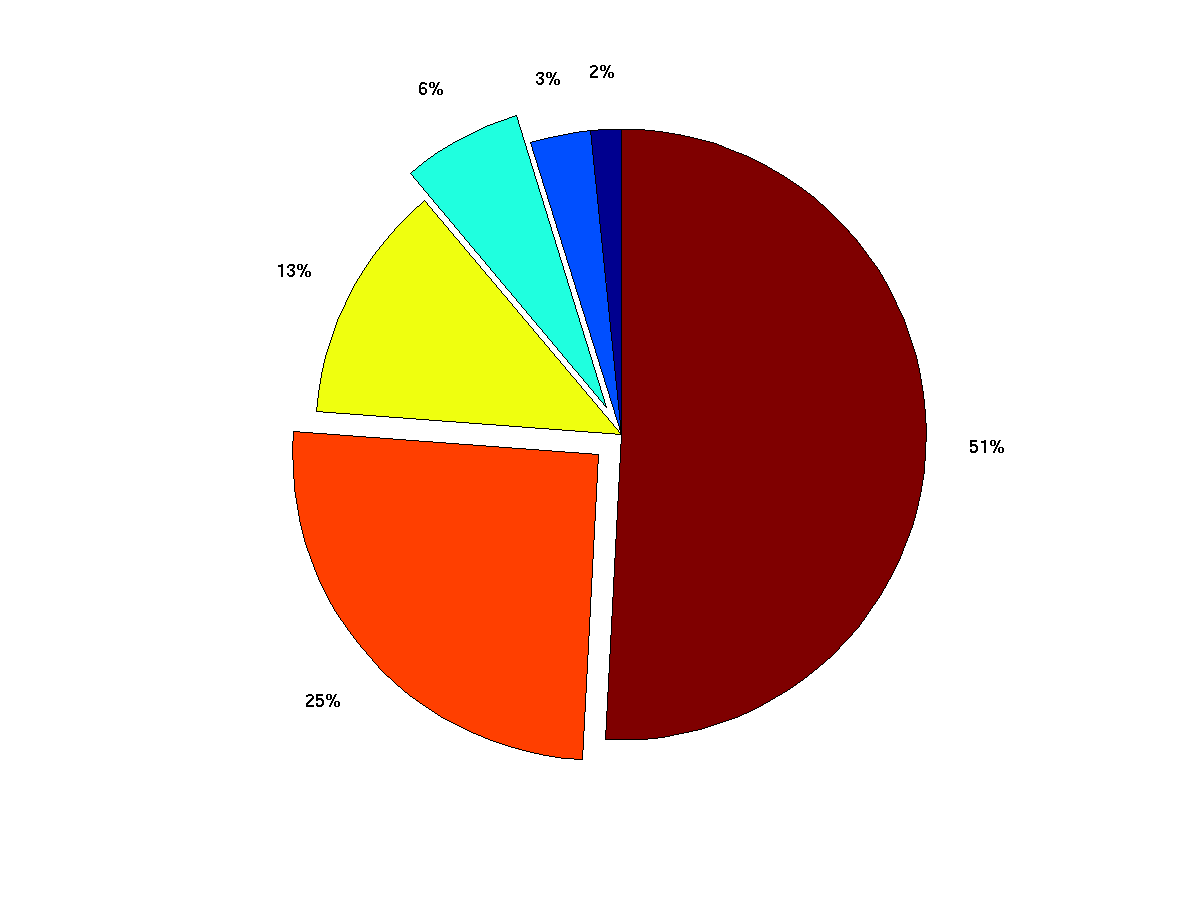
Can provide logical vector to make certain slices "explode".
pie (2 .^ (0:6), [0 0 1 0 1 0]); % third and fifth piece explode
-
Can use to draw a two-dimensional array grid, color-coded based
on integer indexes into a colormap.
      dice = ceil( rand(2,8) * 6);
      image(dice);
      colormap(lines);    % better choice of colors
      axis equal;         % make squares
      axis off;           % don't bother labeling the axis

-
-
-
-